Showing posts with label GDP. Show all posts

Friday, July 20, 2012

The Size of National Economies Version 2


In this post I wanted to  have a another go at the figures I made a few months ago in "The Size of National Economies".

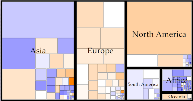
I have since found out that these diagrams are called treemaps. Treemaps can display hierarchical data by placing appropriately sized rectangles nested within each other. The data I am using (World GDP) has been grouped into the six continents, then into individual nations. The size of each box represents the size of the respective nation's economy, and the colour of each box indicates the level of per-capita income, with blue boxes indicating a very low per-capita income and orange boxes indicating a very high per-capita income. A couple of these treemaps are displayed below.


I think these charts are very informative on wealth and income levels in different parts of the world. The first treemap illustrates the point that the economic world is dominated by the Northern Hemisphere. Asia, Europe and North America contribute over 90% of World GDP. It is also interesting to compare the wealth of different continents. The colouring of the rectangles shows us that European countries generally have a high level of income while African countries have a low level of income.

Any comments or questions are welcome. Thanks for reading.

Saturday, June 30, 2012

Visualising the Structure of Economies

For this post, I wanted to show an economic graphic I have been working on. For the last year or I have become increasingly interested in innovative ways of presenting data, which has been inspired partly from a Statistics New Zealand working paper from August last year called “Visualising official statistics”. Recently, I have been experimenting with a graphic that shows the size and structure of a particular country’s economy. I am now at the stage of gathering feedback from friends and experts in order to improve its clarity and effectiveness.
The particular graphic I have been working on is based partly on the work of Hidalgo’s tree representation of the Human Development Index, and Hans Rosling’s “Gapminder World” dynamic graphic, both of which are discussed in the Visualising official statistics paper.


In its current form, the above graphic I have constructed above resembles a tree with three parts. The base shows the size of a nation’s economy, with the shape determined by population and per-capita income. The second part displays three branches, showing the contribution to national GDP by the primary, secondary and tertiary sectors. The topmost section splits these three sectors up further into more branches.
To see how effective this graphic would be, I have applied the graphic to the following countries (only the bottom two parts are shown):


As you can see, the economy of Australia is much larger than New Zealand, due to their greater population and higher per-capita income. Both countries economies rely largely on the service sector.

The three images above portray the world's three largest economies: The United States, China, and Japan. China has a large Gross Domestic Product despite their low per-capita income level ($8 400), due to their large population. The United States has a smaller population but a much larger per-capita income ($48 100). The service sectors in Japan and the US make the greatest contribution to GDP in their respective countries (76% and 77% respectively). In China, the contribution to the economy is mostly spread between industry and services (44% & 47% respectively). 

It would be great to know what you think about this graphic and the possible improvements that could be made to make it better at conveying information.

Sunday, April 15, 2012

The Size of National Economies

In this post I want to show you a couple of images I have made. These images show how the sizes of different economies compare to each other. The figures (Gross Domestic Product) are taken from the IMF and  are calculated using Purchasing Power Parity (PPP) calculations. PPP adjusts international currencies so that a certain amount of money has the same purchasing power in each country, and allows for a more realistic comparison of incomes between different countries.
The first image below divides the world into six continents, and shows how much the different economies contribute to world GDP. As you can see, the northern continents of Asia, Europe and North America dominate the world economically, making up nearly 90% of total world GDP.


The second image I have splits these continents up into individual countries, with the table below showing their individual percentage contributions to total world GDP. There are no surprises to see that countries like America, China and Japan dominate this picture. It is interesting to see how some countries dominate their respective regions economically, such as Australia, Brazil, or the USA. Some countries like Brazil unexpectedly feature quite prominently in this picture, while other nations have a surprisingly small contribution to world GDP.


Country Percentage contribution to World GDP
Asia
China 14.34%
India 5.67%
Japan 5.57%
Korea, South 1.97%
Indonesia 1.42%
Iran 1.18%
Taiwan 1.12%
Saudi Arabia 0.86%
Thailand 0.79%
Pakistan 0.62%
Malaysia 0.57%
Philippines 0.50%
Hong Kong 0.45%
Singapore 0.40%
Vietnam 0.38%
Bangladesh 0.36%
Rest of Asia 2.60%
Europe
Germany 3.92%
Russia 3.01%
United Kingdom 2.86%
France 2.81%
Italy 2.32%
Spain 1.79%
Turkey 1.34%
Poland 0.97%
Netherlands 0.90%
Belgium 0.53%
Sweden 0.48%
Austria 0.45%
1
Switzerland 0.43%
2
Ukraine 0.42%
3
Greece 0.39%
4
Czech Republic 0.35%
5
Norway 0.34%
6
Romania 0.33%
7
Portugal 0.31%
8
Denmark 0.27%
9
Finland 0.25%
10
Hungary 0.25%
11
Ireland 0.23%
12
Rest of Europe 2.00%
North and Central America
United States 19.10%
Mexico 2.10%
Canada 1.76%
Rest of Nth and Ctl America 0.64%
South America
Brazil 2.93%
Argentina 0.90%
Colombia 0.59%
Venezuela 0.47%
Peru 0.38%
Chile 0.36%
Rest of South America 0.37%
Africa
South Africa 0.70%
Egypt 0.65%
Nigeria 0.53%
Algeria 0.34%
Morocco 0.21%
Rest of Africa 3.40%
Oceania
Australia 1.16%
New Zealand 0.16%
Rest of Oceania 0.08%


Any comments or questions are welcome. Thanks for reading.

Friday, March 16, 2012

Median Income in New Zealand

In this post I want to discuss median income, and how it has changed in New Zealand in the last ten years.

When economists want to analyse how the wealth and living standards of people within a country are progressing, most of the time they look at GDP per-capita. The use of this statistic has a couple of key advantages:
  • It is (relatively) straightforward to measure.
  • It is positively correlated with many other standard-of-life indicators (e.g. life expectancy, education, life satisfaction).  
However, there is one key disadvantage of GDP per-capita, and that is it is a very indirect way of approximating living standards. many items that are included in GDP calculations do nothing to improve living standards (e.g. profits from foreign owned companies sent back overseas) while some activities that improve living standards are not included in GDP estimates (e.g. a new public transport initiative that reduces pollution and commuter time). To get a better grip on changes in living standards, researchers use other data sources to complement GDP data, such as wage levels, indices like the human development index, or even happiness surveys. To analyse standard of living changes, I like to use yearly median income, as it directly measures what people are earning in the country. Compared to average income, median income is less biased as it can't be skewed upwards the average income inevitably is.

And so on my analysis. I have used inflation adjusted New Zealand income data from the IRD. As with my Gini coefficient study, I only wanted to consider full-time workers, so I removed anyone who earns less than the full-time wage for each year. I thought that this would reduce the bias in my investigation, and besides, I am more interested in the changes in median income and not the actual value.


YearMedian income (nominal values)Median income (2010 prices) 
2001$28,500$35,800
2002$29,500$36,000
2003$30,500$36,700
2004$32,500$38,200
2005$35,500$40,600
2006$37,600$41,300
2007$40,500$43,600
2008$42,500$44,000
2009$43,500$44,200
2010$43,500$43,500


As you can see from the table and chart, the first ten years of 2010 have been a decade of two halves. From 2002 to 2007 median yearly income jumped from $30 000 to $40 000, an increase of around 4% per-year in real terms. After 2007, growth in median income vanished, probably as a result of the Global Financial Crisis and subsequent recession. It would be very interesting to see how median income will change in the coming years.


Wednesday, January 18, 2012

Are the quarterly GDP growth announcements misleading?

In this post I want to talk about an issue that has been bugging me slightly over the last year, which is the quarterly Gross Domestic Product (GDP) growth announcements made by Statistics New Zealand. These announcements are important as they are an indicator of prosperity within the country.

Every three months the latest GDP figures are released, generally following this schedule:

Late March:            GDP figures for the previous December quarter are released
Late June:               GDP figures for the previous March quarter (January to March) are released
Late September:     GDP figures for the previous June (March to June) quarter are released
Late December:      GDP figures for the previous September quarter are released

Other economists, the Treasury, and the Reserve bank make their own predictions on GDP figures, but the table above shows when the definitive GDP numbers are released. If you want concrete, hard facts on how the economy is actually doing, you have to use GDP figures that are at least 3 months old, or even older. Say for example it was early December and you wanted to describe the state of the economy. One of the most important pieces of information you need to that is five months old!


The other thing that annoys me about the GDP announcements is that they are generally only released and reported in aggregate (and not per-capita) terms. As an indicator of prosperity, aggregate measures of GDP are not quite as useful as per-capita measures. GDP per-capita figures are more likely to be affected by things that have an impact on our quality of life, such as productivity or income. Aggregate, or total GDP is affected by productivity and income, but can also be affected by changes in population, which does not necessarily improve the quality of life experienced by people within a country.

If you were planning on using GDP figures to get a better picture on how we are doing as a nation, It would be far better to to use per-capita values rather than the aggregate values. However, Statistics New Zealand make no mention of GDP per person at all in their releases!

The table and chart below shows how the total production of NZ has changed from quarter to quarter, and it is these figures that are broadcast by the media to discuss the health of the economy. At the moment, the the most up to date figure on GDP is from September 2011, when an increase of 0.8% was recorded over the June 2011 quarter. These increases are recorded in real terms (i.e. taking inflation into account). The table below shows how GDP has changed in the last three years. (At the moment, total GDP in New Zealand stands at around 200 Billion $NZ, and per-capita GDP is around 42 000 $NZ). Between the start of 2008 and September 2011, Total GDP (measured in constant prices) fell slightly by 0.3%


QuarterPercentage increase in GDP from previous quarter
2008Mar-0.3
Jun-0.6
Sep-0.5
Dec-1.2
2009Mar-1.1
Jun0.1
Sep0.1
Dec0.8
2010Mar0.3
Jun0.3
Sep-0.1
Dec0.3
2011Mar0.7
Jun0.1
Sep0.8


The following chart and table show how per capita GDP has changed in the last four years. Over this period, per capita GDP fell by 3.9%. These figures are generally not reported by Statistics New Zealand


QuarterPercentage increase in per capita GDP from previous quarter
2008Mar-0.5%
Jun-0.7%
Sep-0.8%
Dec-1.5%
2009Mar-1.4%
Jun-0.1%
Sep-0.3%
Dec0.5%
2010Mar0.0%
Jun0.1%
Sep-0.4%
Dec0.1%
2011Mar0.5%
Jun0.0%
Sep0.6%


If we compare the two growth rates in the same chart, we can see that total GDP quarterly change figures (in blue) are consistently higher than the per-capita change figures (in red). This because the total figures are augmented by New Zealand's increasing population. At the moment, Statistics New Zealand only release the figures in blue. If people are only glancing at these figures in the news, (which most are) they will get a slightly distorted, sugar-coated summary of the economy at any point in time. This is why I think the announcements are slightly misleading.


As I have stated above, per-capita GDP growth figures are a better indicator on how the quality of life within a country has improved, and its inclusion in growth announcements would improve people's understanding on the state of the economy. Now, I don't think the Statistics department have deliberately sought to pull the wool over any one's eyes. I just believe that Statistics New Zealand could include per-capita GDP figures in order to inform the public a bit better on how the economy is going.

So, those are my two issues with Statistics New Zealand. For the first issue, on the lengthy delay between quarters and their corresponding growth figures, I'm not really upset. I know there is a trade off between accuracy and speed. I would rather wait for accurate figures than have incorrect figures quickly.

On the second issue, I just want to say that if Statistics New Zealand go to so much trouble to collate these figures, It would make sense to present their data in a way that allows for an open and honest interpretation.

Finally, I want point out that GDP and GDP per-capita are not a perfect measures of the quality of life experienced by a society, and they should not be the primary focus of a government. They are just ways of measuring how we are doing as a nation. If we focus on more important issues, economic growth will take care of itself.
Tuesday, November 1, 2011

Is New Zealand moving to a new steady state? The effects of a change in the savings rate

In this post I have no new data to analyse. Instead, I want to give my thoughts on what I think is happening, or what I hope is happening to the economy of New Zealand.

According to just about every social, political and economic commentator in the country, we have an abysmal rate of saving. In the past, only economists and the Reserve Bank Governor said this. However, it seems that these cries were ignored. Not many people are going to listen to advice from a gloomy old economist or Reserve Bank Governor when they are thinking about buying a new TV.

Now However, it seems that insulting some of our ingrained habits is the "in" thing at the moment. Apparently we are terrible drivers and apparently we are terrible savers. but has this increase in derision at our poor level of saving (combined with the recent recession), increased our rate of saving?

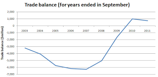
Well maybe it has. Since 2007 retail sales figures have struggled to gain momentum (see chart below). You could argue that this is due to high unemployment figures, but there is another more basic piece of evidence to suggest our savings rate has gone up in recent times: Trade surpluses.


As you can see in the chart below, New Zealand has had a better trade balance in recent years, suggesting that our spending has decreased and saving increased.


So if our saving rate has gone up, what does this mean for the country? well in economist terms, it could mean that we experience an increase in our steady-state  rate of growth, which I will proceed to explain by example.

Suppose we have a person earning a constant $100 000. They decide to spend 80% of what they earn and save the remaining 20% at an interest rate of 7%.

In year one they will earn $100 000, spend $80 000 and save $20 000.

In year two they will earn $100 000 plus $1400 (interest income $20 000 X .07), spend $81 120, and save $20 280.

Over time, their expenditure over a 40-year period will look like this:


So expenditure increases over time which is nice. In this example, income and expenditure is increasing at a rate of 1.4% each year, which is the steady-state rate of growth.

But what if this person decided after ten years to increase their savings rate to 50% of income? We would get the situation with the red line in the figure below.


In the years immediately following the saving rate change, expenditure drops sharply, but eventually catches up to and overtakes the amount of spending that would have taken place (dashed line) due to the increase in income from saving dividends. In this example the steady-state rate of growth has increased to 3.5%.

If we use this example to discuss the New Zealand economy (approximating expenditure to Gross Domestic Product, or GDP) then the shaded area in the above chart is where I think our economy is now, given my earlier theory of an increase in savings. If this is true, then the current stagnation in GDP and high unemployment figures are partly caused by a change in spending/saving rates. However, this should only be temporary, and GDP in a relative sense will increase as the dividends from our extra savings start to kick in (and as our steady state rate of growth improves).

Of course, this model is only an example. It can only reflect a few aspects of reality and it has some limitations:
  • The time needed to "overtake" the dashed line in the real world could be more or less that that taken in the example, where only arbitrary numbers were used. 
  • The New Zealand economy is not just affected by the saving rates of different citizens, but by other global and domestic events, making the situation not quite as straightforward as that described by this post.
  • For the increase in the steady-state rate of growth to be permanent, individuals and governments need to stick with the habit of saving at the increased rate. I have serious doubts that this will happen.
In conclusion, global and domestic events may make the picture on saving and spending a little murky. Murky or not however, an increase in saving will definitely help improve prosperity and the long-term future of New Zealand.