In this post I wanted to have a another go at the figures I made a few months ago in "The Size of National Economies".
I have since found out that these diagrams are called treemaps. Treemaps can display hierarchical data by placing appropriately sized rectangles nested within each other. The data I am using (World GDP) has been grouped into the six continents, then into individual nations. The size of each box represents the size of the respective nation's economy, and the colour of each box indicates the level of per-capita income, with blue boxes indicating a very low per-capita income and orange boxes indicating a very high per-capita income. A couple of these treemaps are displayed below.
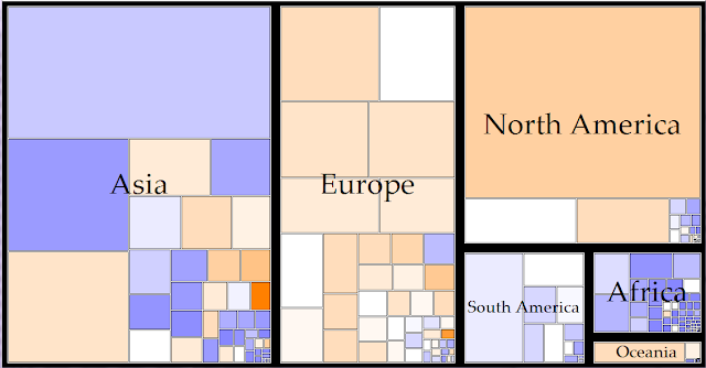


I think these charts are very informative on wealth and income levels in different parts of the world. The first treemap illustrates the point that the economic world is dominated by the Northern Hemisphere. Asia, Europe and North America contribute over 90% of World GDP. It is also interesting to compare the wealth of different continents. The colouring of the rectangles shows us that European countries generally have a high level of income while African countries have a low level of income.
Any comments or questions are welcome. Thanks for reading.
this is brilliant - thank you
ReplyDeleteThis is cool- do you think you can update it? I wanna see if the size of China has changed much.
ReplyDeleteExcellent way to represent the data and provide comparisons!
ReplyDelete