Saturday, June 27, 2015

The 100 Most Densely Populated Suburbs in New Zealand


In this post, I will be looking at most densely populated suburbs (area units) in New Zealand, or the area units that have the highest number of people per square kilometre.
This analysis has been done by extracting data on the population of area units in New Zealand. These figures have been sourced from Statistics New Zealand, and are estimates of each area’s population as at the 30th of June 2014. I have also sourced data on the land area of each area unit, measured in square kilometres.
For starters, the 10 most densely populated suburbs are listed below:
 
Of the ten most densely populated suburbs, six are in Auckland and four are in Wellington. It is very interesting to note that Auckland Central East and West have a much higher density than other suburbs in this list, at around 12,000 people per square kilometre.
If we expand this list to look at the 100 most densely populated suburbs, we find the following results:
 
These 100 suburbs contain 10% of New Zealand’s total population, but contain only 0.0379% of New Zealand’s total land area. As you would expect, Auckland dominates this list. Only 16 of the top 100 are outside Auckland, and only one suburb is outside the three main centres (Insoll, Hamilton).
I am a little bit surprised by these figures. Obviously I was expecting Auckland to dominate this list, but I thought I would see more suburbs from Christchurch and Wellington, and possibly a couple from Dunedin or Tauranga.
It would be very interesting to see how the population density of these areas has changed over the last few years, and this might be something I investigate in a future post.


Saturday, April 11, 2015

Blue Moons and the Rarity of All Black Home Losses

Blue Moons and the Rarity of All Black Home Losses

In recent years the form of the New Zealand rugby team has been spectacular. Some of their recent achievements include:
·         Winning the 2011 World Cup
·         A “perfect season” in 2013
·         Winning all three editions of the Rugby Championship (2012, 2013, 2014), and only losing one of their 18 matches in three editions in the competition.
Of particular interest to me is their form on home turf. Since losing to South Africa in Hamilton in 2009, the All Blacks have won every one of their most recent home games (36). This remarkable feat led me to the following question:
How rare are All Black home losses?
To answer this, I decided to compare All Black home losses with the occurrence of blue moons, which are colloquially known as a rare event. More importantly though, their rarity is measurable or observable, unlike other events such as pigs flying or hell freezing over.

Traditionally, a blue moon was said to occur when there were four full moons in a season (Autumn,  Winter, Spring, Summer), although nowadays the more common definition of a blue moon is the occurrence of a second full moon in a month. For the purposes of this article I will use the latter definition.

Summary of All Black Home Matches by Decade*
 
Number of Matches
Time Period
won
lost
drawn
total
1904-1949*
16
7
2
25
1950s
14
5
1
20
1960s
22
2
1
25
1970s
12
6
1
19
1980s
29
4
0
33
1990s
34
7
1
42
2000-2009
50
6
0
56
2010+
35
0
0
35
Total
212
37
6
255

 
Percentage of Matches
Time Period
won
lost
drawn
1904-1949
64%
28%
8%
1950s
70%
25%
5%
1960s
88%
8%
4%
1970s
63%
32%
5%
1980s
88%
12%
0%
1990s
81%
17%
2%
2000-2009
89%
11%
0%
2010+
100%
0%
0%
Total
83%
15%
2%

The All Blacks have played at home 255 times since their first home game in 1904 against Great Britain. They have won 212 (83%) of these matches, and lost 37 (15%). The other 6 games ended as draws.
One interesting thing this table shows is that the All Blacks played very few matches in the first half of the 20th century compared to recent years. The All Blacks have played more home test matches in the past five years (35) than they did in the 47 year period between 1904 and 1949 (25).
The win percentage table shows that their success rate has tended to improve over the years. Up to 1950 the All Blacks had won 64 percent of their home test matches. Between 2000 and 2009 they won 89 percent of their home test matches.
The next table compares the number of home losses with the number of blue moons by decade.
All Black Home Losses vs Blue Moons 1904-Present
Time Period
AB home losses
Blue Moons
1904-1949
7
19
1950s
5
4
1960s
2
5
1970s
6
3
1980s
4
4
1990s
7
5
2000-2009
6
4
2010+
0
1
Total
37
45

This table shows that in the period since the All Blacks played their first match in New Zealand, there have been 45 blue moons and 37 home losses. This essentially proves that you can legitimately answer my earlier question by saying that:

“All Black losses at home are rarer than blue moons”

You could argue that the period from 1904-1949 shouldn’t be included in this analysis, given that the New Zealand rugby team played so few games in the first half of the 20th century. For this simple study however, I am including the entire period for completeness.
So how does New Zealand’s home record compare with the home record of some of the largest rugby playing nations?

Rugby Test Match Home Losses for Other Nations 1904-Present
Nation
Home  Losses
Australia
110
England
88
France
112
South Africa
52
Wales
119
New Zealand
37

Blue moons in same period
45
Summary of Rugby Test Home Matches by Selected Nations 1904-Present
 
Number of Matches
Nation
Wins
Losses
Draws
Total Matches
Australia
170
110
11
291
England
193
88
25
306
France
219
112
11
342
South Africa
160
52
11
223
Wales
187
119
11
317
New Zealand
212
37
6
255

The last two tables here show that none of the other rugby playing nations listed here can make the same blue moon claim I made for the New Zealand team. I think it is highly unlikely that any other team would be able to make this claim either, because to achieve it, a team would only be able to lose at home once every 2.5 years (on average).
So in conclusion, my question was:

How rare are All Black losses at home?

And my answer, backed up by statistics is:

“All Black losses at home are rarer than blue moons”

And it is highly unlikely that other rugby playing nations can make the same claim.
Thanks for reading


Friday, February 13, 2015

A Population Cartogram of New Zealand

Which depiction of New Zealand (below) is more representative or accurate?


From a navigational or geographical perspective, the image on the left is more accurate. But what if you wanted you wanted to look at the country from another angle, such as population?

If you wanted to get more information on the population distribution of the country in more detail, a traditional map would not be very useful, unless you knew the population was distributed perfectly evenly everywhere.

Obviously, New Zealand’s population is not distributed evenly. Urban regions will contain more people in a given area, and rural areas will contain fewer people.

How do you visualise this though?

In this article, I have attempted to this. By collecting land area and population data for each of New Zealand’s 16 regions, I have constructed a cartogram (above, right) which re-sizes each region based on their population. This can be compared with an ordinary map of New Zealand.


While this cartogram and the traditional map of New Zealand are curious to look at and compare, ordinary bar charts of the information itself can also add perspective.


These charts show that while Auckland is the second-smallest region in the country in terms of area, it is by far the most populous. In fact, Auckland has nearly three times the population of Canterbury, the second-most populous region in the country.

Wellington, with around 8100 square kilometers, is the fourth smallest region but the third most populous.

The West Coast region is fifth largest, but has the lowest population out of all 16 regions, and contains only 1/47th of Auckland’s population.

Waikato has nearly an equal share of New Zealand’s population (9.6%) and land area (9.4%)
Land area and population data can be combined to calculate population density, which in this article is measured in terms of ‘people per square kilometer’.


Auckland, at 312 people per square kilometre is the most densely populated region in the country, and is over 200 times more densely populated than the West Coast.

Nelson is an especially unique case. It is the smallest region and at less than one-tenth the size of Auckland (the second smallest region), it stands as an outlier in these charts. The Nelson region also has the second-highest population density.

An expanded cartogram of New Zealand by regional population is below. 


Some obvious points of interest are the increased size of Auckland and the North Island compared to the rest of the country and the South Island, but other noteworthy elements include:
  • The dramatic decrease in size for the Tasman, Marlborough, Southland, Otago, West Coast and Gisborne regions. The re-sized versions of the West Coast and Gisborne regions seem particulary miniscule compared to their true areas.
  • The slight decrease in size for the Manawatu-Whanganui and Hawke’s Bay regions.
  • Northland, Waikato, Bay of Plenty, Taranaki, and Canterbury remaining roughly the same size.
  • Wellington increasing significantly in size.

In the past, the South island regions had a larger share of the country’s total population than they do now.  It would be interesting to have a series of cartograms based on historical population estimates to see how the location of New Zealand’s population has changed in the past, and how it might change in the future.


Sources
Land area data: retrieved from regional council websites


Wednesday, August 15, 2012

Treemap of the NZX

As you would have noticed in my previous posts, I am currently fascinated with treemaps. I recently
constructed a couple of treemaps of the New Zealand Stock Exchange, and thought you may be interested in viewing them.

In the attached treemaps, each listed company on the NSZX is represented by a coloured box. The size of the boxes are determined by the market capitalisation of each company, and the colour of the boxes are determined by their performance on the NZSX from the start of the year to July (A deep red shade indicates very poor performance, a deep Green shade indicates very good performance, and lighter shades indicate less extreme positive or negative performance).

The first treemap shows the contribution of each sector (i.e. services, property, primary, goods, investment, energy) to the overall size of the NZSX. In the second treemap, each box/company is in the same position as the first treemap, and is identified by their three-letter-code. A good test to check your knowledge of the NZSX would be to try and name as many of these companies as possible.


It would be great to know what you think about these graphics and the improvements that could be made to improve them.

Friday, July 20, 2012

The Size of National Economies Version 2


In this post I wanted to  have a another go at the figures I made a few months ago in "The Size of National Economies".

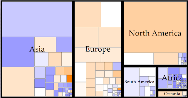
I have since found out that these diagrams are called treemaps. Treemaps can display hierarchical data by placing appropriately sized rectangles nested within each other. The data I am using (World GDP) has been grouped into the six continents, then into individual nations. The size of each box represents the size of the respective nation's economy, and the colour of each box indicates the level of per-capita income, with blue boxes indicating a very low per-capita income and orange boxes indicating a very high per-capita income. A couple of these treemaps are displayed below.


I think these charts are very informative on wealth and income levels in different parts of the world. The first treemap illustrates the point that the economic world is dominated by the Northern Hemisphere. Asia, Europe and North America contribute over 90% of World GDP. It is also interesting to compare the wealth of different continents. The colouring of the rectangles shows us that European countries generally have a high level of income while African countries have a low level of income.

Any comments or questions are welcome. Thanks for reading.

Saturday, June 30, 2012

Visualising the Structure of Economies

For this post, I wanted to show an economic graphic I have been working on. For the last year or I have become increasingly interested in innovative ways of presenting data, which has been inspired partly from a Statistics New Zealand working paper from August last year called “Visualising official statistics”. Recently, I have been experimenting with a graphic that shows the size and structure of a particular country’s economy. I am now at the stage of gathering feedback from friends and experts in order to improve its clarity and effectiveness.
The particular graphic I have been working on is based partly on the work of Hidalgo’s tree representation of the Human Development Index, and Hans Rosling’s “Gapminder World” dynamic graphic, both of which are discussed in the Visualising official statistics paper.


In its current form, the above graphic I have constructed above resembles a tree with three parts. The base shows the size of a nation’s economy, with the shape determined by population and per-capita income. The second part displays three branches, showing the contribution to national GDP by the primary, secondary and tertiary sectors. The topmost section splits these three sectors up further into more branches.
To see how effective this graphic would be, I have applied the graphic to the following countries (only the bottom two parts are shown):


As you can see, the economy of Australia is much larger than New Zealand, due to their greater population and higher per-capita income. Both countries economies rely largely on the service sector.

The three images above portray the world's three largest economies: The United States, China, and Japan. China has a large Gross Domestic Product despite their low per-capita income level ($8 400), due to their large population. The United States has a smaller population but a much larger per-capita income ($48 100). The service sectors in Japan and the US make the greatest contribution to GDP in their respective countries (76% and 77% respectively). In China, the contribution to the economy is mostly spread between industry and services (44% & 47% respectively). 

It would be great to know what you think about this graphic and the possible improvements that could be made to make it better at conveying information.

Wednesday, May 30, 2012

Productivity in different sectors of the economy

In this post I wanted to look at productivity in different sectors of the New Zealand economy. Productivity is an important measure in economics, as it measures what can be produced with a given amount of inputs. The greater the productivity, the greater the amount of goods and services that can be produced. It is one of the main reasons why countries like Luxembourg and the United States are as rich as they are. Their high productivity means the workers in these countries are able to produce more in less time than workers in other countries.

So now I pose a question:

Who are the most productive workers in the New Zealand economy?

In principle, this should be a very easy question to answer. Simply look at the production figures for each sector of the economy, and divide this by the number of workers in each sector. Unfortunately, it’s not quite that simple, as the data makes no distinction between part-time and full-time workers.

The figures for this analysis are taken from Statistics New Zealand, which is a reliable source of information. I have, on the chart below, the number of workers in each sector, and each sector's contribution to GDP for 2011.

The missing element that lets this analysis down however, is the lack of data on hours worked in each industry. In some sectors such as retail and restaurants, there is a greater proportion of people working part-time compared to other industries such as manufacturing. Statistics New Zealand does have data on total hours worked in New Zealand, but unfortunately, this is not broken down into different economic sectors. A true analysis of worker productivity would divide total production by hours worked, instead of dividing by the number of workers. This means that the figures below need to be taken with a pinch of salt. Figures are in current NZ dollars

Table 1: Output per-worker in New Zealand
 
Sector Number of workers in sector GDP  per sector GDP per worker
Agriculture, fishing, forestry, and mining                          159,900 $15,398,000,000 $96,298
Manufacturing                          256,800 $24,699,000,000 $96,180
Electricity, gas, and water                             16,800 $3,996,000,000 $237,857
Construction                          178,800 $7,981,000,000 $44,636
Wholesale trade                          109,000 $14,861,000,000 $136,339
Retail, Accommidation and Restaurants                          335,500 $15,394,000,000 $45,884
Transport and communication                          140,600 $21,177,000,000 $150,619
Finance, insurance, and business services                          346,700 $59,347,000,000 $171,177
Government admin and defence                          126,900 $10,116,000,000 $79,716
Personal and Community services                          558,400 $24,737,000,000 $44,300
Total                       2,229,400          197,706,000,000 $88,681


As you can see, the most productive sectors according to this analysis are electricity, gas and water, finance, and transport and communication. This is likely to be because these sectors normally produce high-value goods and services, and use capital such as computers and heavy transport machinery to increase production. As I suspected, the sectors where there is more part-time employment were the least productive, but as I stated above, a different result may occur if hours worked was used instead of the absolute number of workers per sector. Nevertheless, it is still interesting to see the number of workers involved in each industry and their contribution to national production.