For this post, I wanted to show an economic graphic I have been working on. For the last year or I have become increasingly interested in innovative ways of presenting data, which has been inspired partly from a Statistics New Zealand working
paper from August last year called “Visualising official statistics”. Recently, I have been experimenting with a
graphic that shows the size and structure of a particular country’s economy. I
am now at the stage of gathering feedback from friends and experts in order to
improve its clarity and effectiveness.
The particular graphic I have
been working on is based partly on the work of Hidalgo’s tree representation of the Human Development Index, and
Hans Rosling’s “Gapminder World” dynamic graphic, both of which are discussed
in the Visualising official statistics paper.
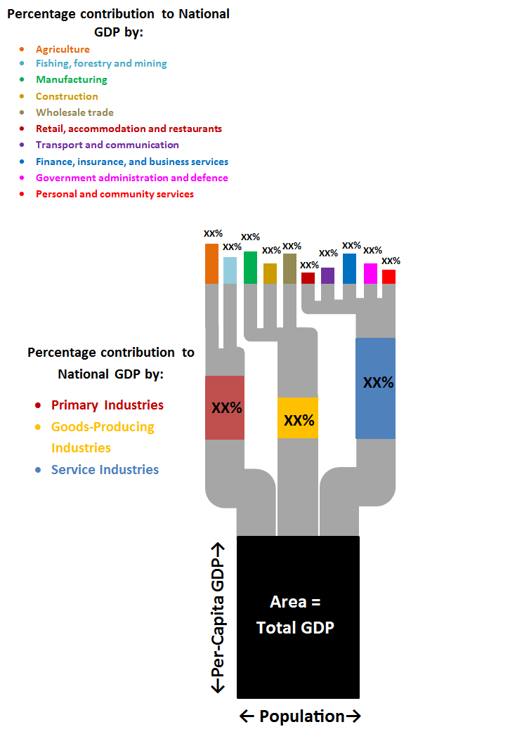
In its current form, the above
graphic I have constructed above resembles a tree with three parts. The base
shows the size of a nation’s economy, with the shape determined by population
and per-capita income. The second part displays three branches, showing the
contribution to national GDP by the primary, secondary and tertiary sectors.
The topmost section splits these three sectors up further into more branches.
To see how effective this graphic
would be, I have applied the graphic to the following countries (only the bottom two parts are shown):
As you can see, the economy of Australia is much larger than New Zealand, due to their greater population and higher per-capita income. Both countries economies rely largely on the service sector.
The three images above portray the world's three largest economies: The United States, China, and Japan. China has a large Gross Domestic Product despite their low per-capita income level ($8 400), due to their large population. The United States has a smaller population but a much larger per-capita income ($48 100). The service sectors in Japan and the US make the greatest contribution to GDP in their respective countries (76% and 77% respectively). In China, the contribution to the economy is mostly spread between industry and services (44% & 47% respectively).
It would be great to know what
you think about this graphic and the possible improvements that could be made
to make it better at conveying information.